Inclusief Design at NTR
Made for everyone, by everyone
2023
Everyone should be able to participate. And to create a place where that is true, everyone is needed.
Inclusive design refers to media design that everyone can perceive and understand, including people with disabilities. Recognizing that there's still a need for greater focus on inclusive design within public broadcasting—and acknowledging that I can't solve everything from my role—I developed this site.
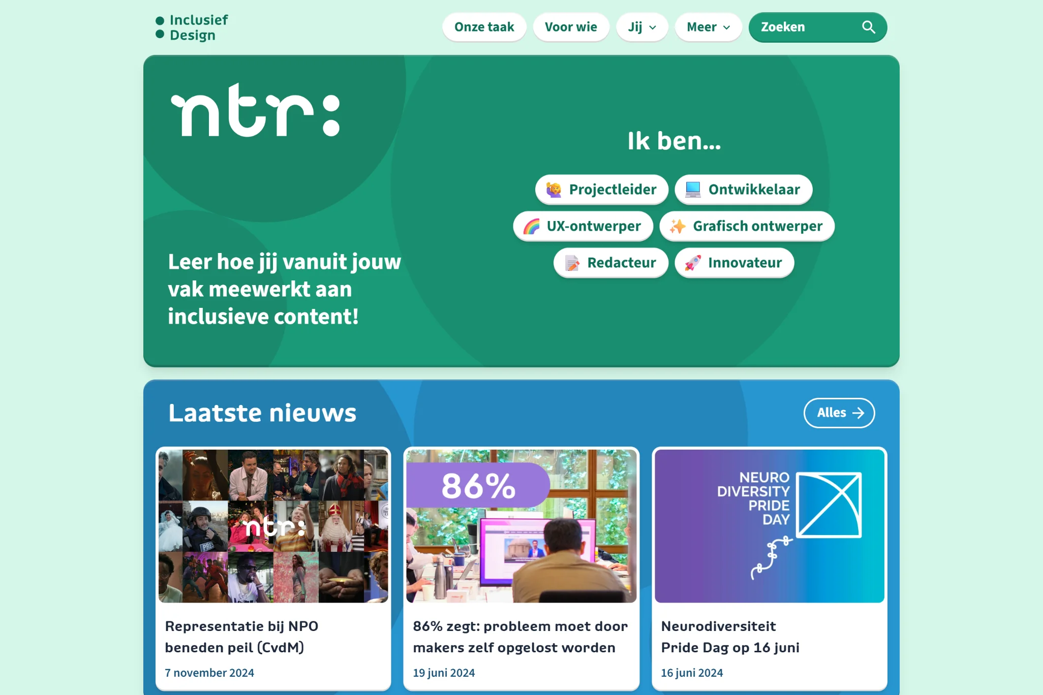
On Inclusief Design, anyone can explore how to contribute to accessible media from their own role. Whether you are an editor, UX designer, graphic designer, developer, project manager, or innovator, this platform provides guidance.
Related projects
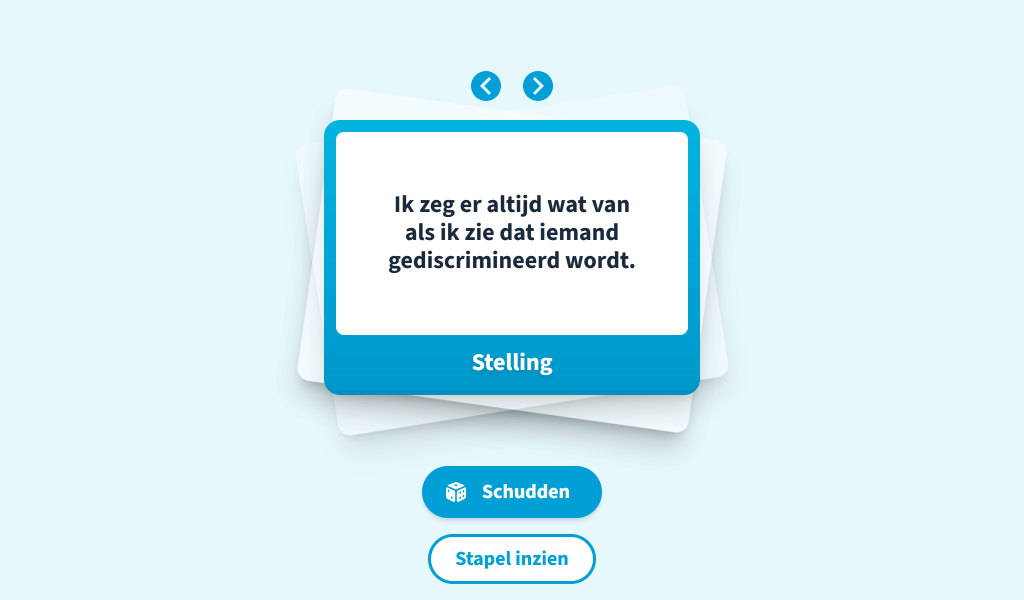

Schooltv Kaartje Keren
Schooltv was looking for an alternative to the "Wheel of Fortune." In the past, they used such a wheel to display various words or phrases that could be spun to randomly select one—sometimes featuring different statements to facilitate class discussions. However, the wheel posed a few challenges. Once more "slices" were added, the text had to be shrunk significantly to fit each segment. In addition, the animation of the colored sections caused excessive on-screen flicker, leading to accessibility concerns. It was time for a solution! A simple design that works for everyone. Together with Tessa Kruiger, I created Kaartje Keren: text on cards that can be flipped with a single click, ensuring ease of use, accessibility, and versatility.
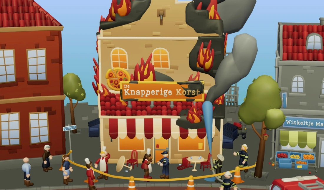
Klokhuis Brand!
There's a fire at the pizzeria! What would you do if you were a reporter, juice vlogger, or investigative journalist? Over the past few months we've been working on this super-fun interactive in which you step into different roles and create your own media. In doing so, children learn how various kinds of media are produced and what motivations lie behind them. This game is especially important in a time when journalism is coming under increasing pressure while everyone is consuming media all day long. Give it a try! Did you know this 3D game is fully accessible? You can even play it if you're blind! The game meets all the required accessibility standards. Developed in collaboration with Marlène Zwetsloot and Tessa Kruiger. The 3D models were created by Brent van den Hove and the script by Fiore Houwing.
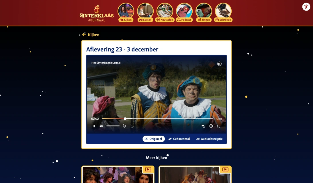
Inclusive Sinterklaasjournaal
A Sinterklaasjournaal for every child: that's why the entire website was redeveloped in 2024. Both UX and technology, as well as new editorial content, have been made accessible. The new website now meets the Web Content Accessibility Guidelines (WCAG) level AA. For color contrast, we've proactively applied the APCA method. Not only have guidelines been implemented, but the site was also pre-tested in various schools with children who have different disabilities. This year also marks the first time that videos with audio description can be accessed directly on the site, without an extra app. Because there's still a lot of content from previous years, an accessibility menu supplements the WCAG implementation. Here, you can filter content based on accessibility and find additional settings, like enabling a dyslexia-friendly font.
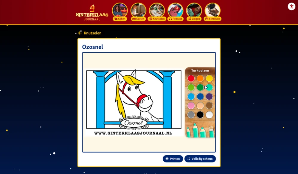
Drawing for blind children
For Sinterklaasjournaal, I explored how we could enable everyone to color: including children who cannot see. The goal was to make as much of the Sinterklaasjournaal website accessible to all children as possible. My solution was to divide coloring pages into parts. With a screen reader, you can navigate step by step through each part of the coloring page. When you click, that part is filled with your chosen color. We validated this concept through UX research in collaboration with Tessa Kruiger and the Visio school in Amsterdam. It was received positively: "I want to make this Ozosnel's favorite color!" As a result, many coloring pages have now been made accessible in this way.
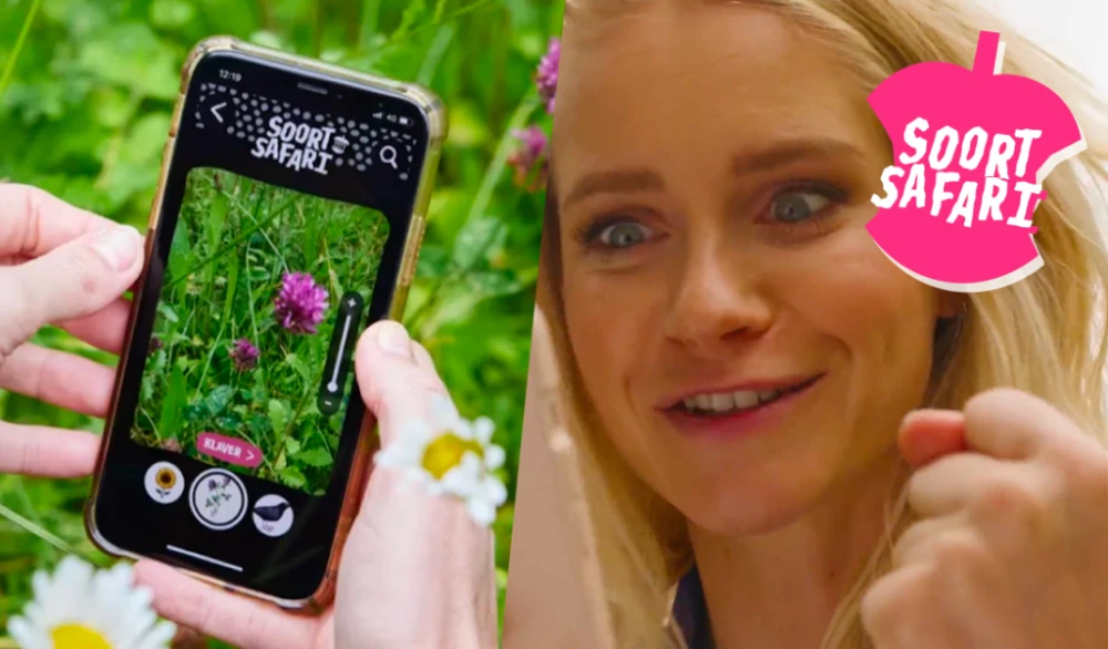
Klokhuis SoortSafari
Over the past 1.5 years, I developed this app for Het Klokhuis, allowing kids to discover nature everywhere - even in the city! Ready for a SoortSafari? There's a new species every week, so collect all 52! For each species, Het Klokhuis presenters search for it in a vlog. Did you know this is Het Klokhuis's first production with built-in audio description in videos for blind and visually impaired users? No separate app or device needed. The image recognition is provided by Naturalis Biodiversity Center Netherlands and Waarneming.nl.
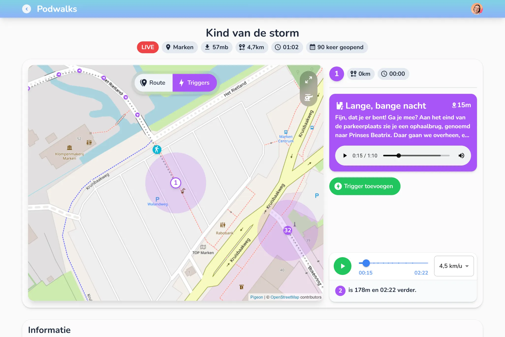
Podwalks CMS
For the podwalk series "Het water komt," not only innovative augmented reality was used, but the creation process was also thoroughly renewed. Previously, walks were created with measured GPS points and audio files that were manually placed in the app. This made the process cumbersome and adjusting walks time-consuming. Time for a change! That is why I designed and developed the Podwalks CMS for NTR. This CMS is live linked to the app of "Het water komt," making adjustments to walks immediately visible. Routes can be visually plotted on a map, and thanks to a simulation function, you can check whether the timing and connection of audio points are optimal. In addition, the CMS offers a range of advanced features, such as rights management, multiple types of triggers on location, built-in API documentation for developers, analytics, route backups, and the ability to upload app-specific files. This makes it not only user-friendly but also flexible and future-proof.